Communities and Courses now support Dark Mode on GoKollab web. Members can switch to a comfortable darker experience, while community owners can configure separate light and dark brand palettes - keeping their identity intact in both modes.
What's New?
One-Click Dark Mode for Members
Members can switch between light and dark appearances directly from the top navigation. The selected mode is remembered across refreshes and applies across the entire experience.
Separate Light and Dark Branding for Owners
Community owners can configure and preview light and dark color palettes independently from
Settings → Appearance
. Editing one palette does not overwrite the other - each mode gets its own brand colors. Choose from preset community themes or fully customize the palette.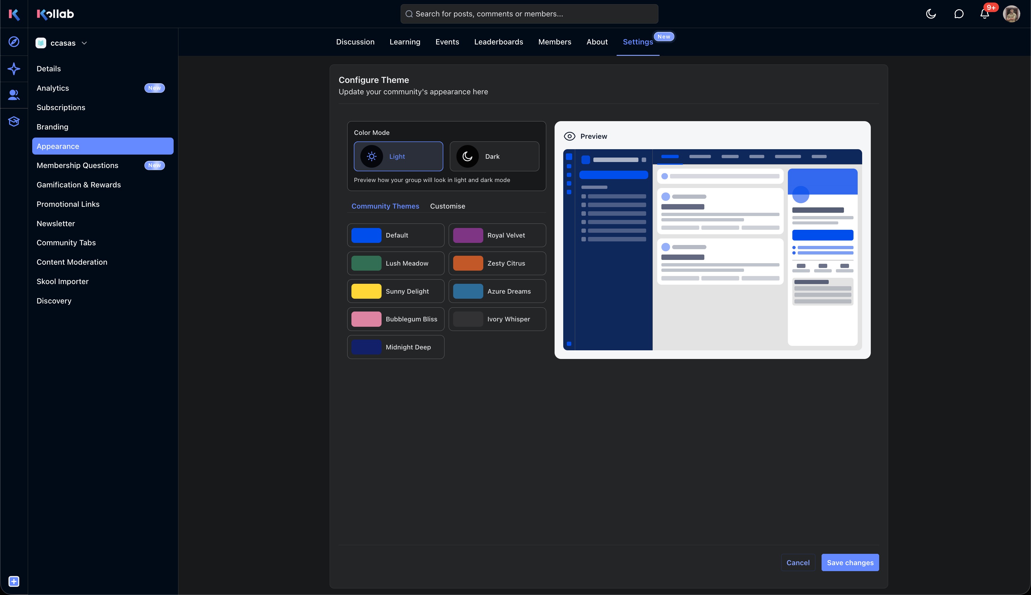
Full Coverage Across Communities
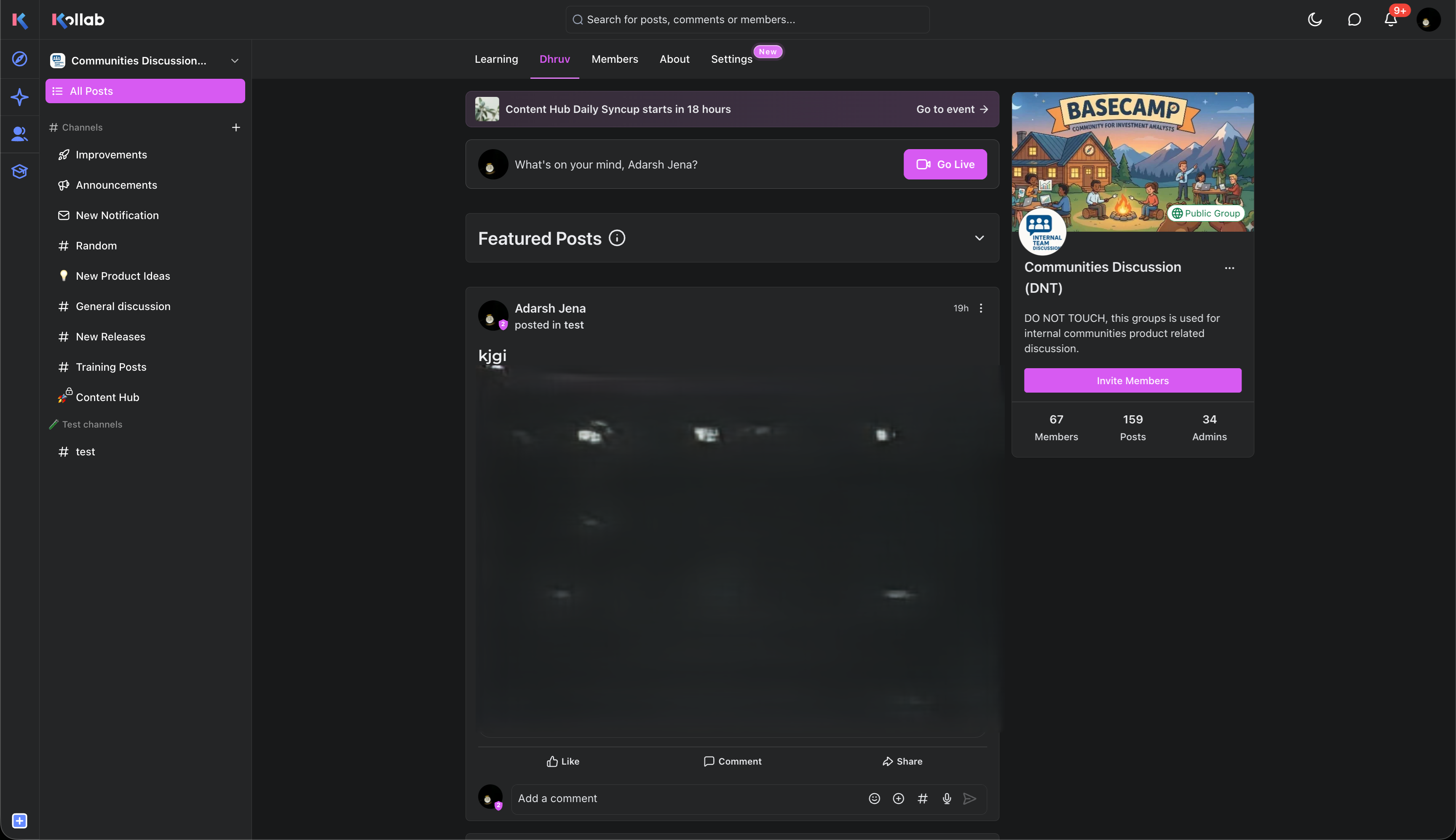
Dark Mode adapts across the entire community experience - posts, comments, channels, chats, members, events, calendars, mentions, attachments, About pages, and community cards all render in the selected appearance.
Learning Experience
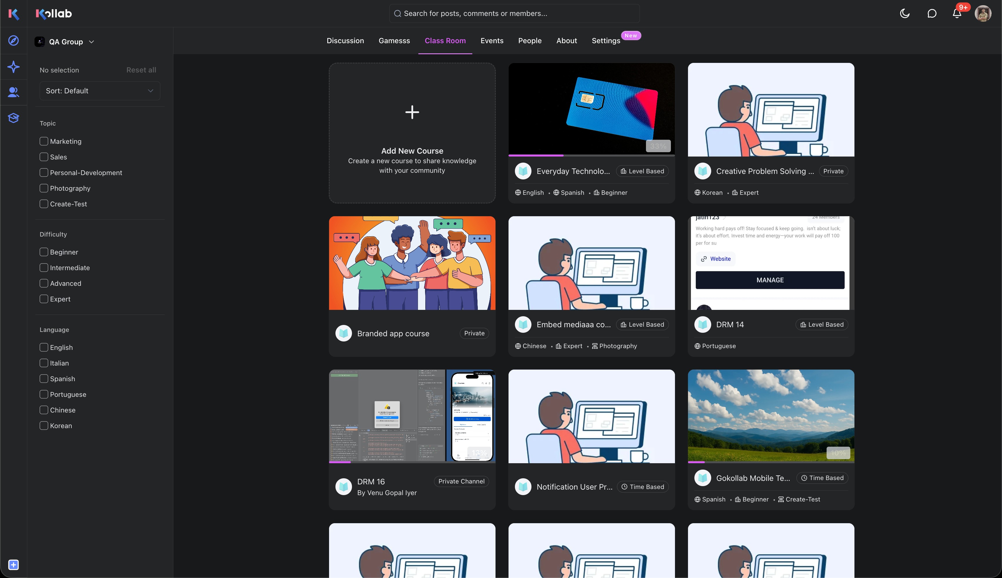
Courses, lessons, assessments, assignments, quizzes, and live-session surfaces remain readable and visually consistent in Dark Mode.
Discovery & Shell
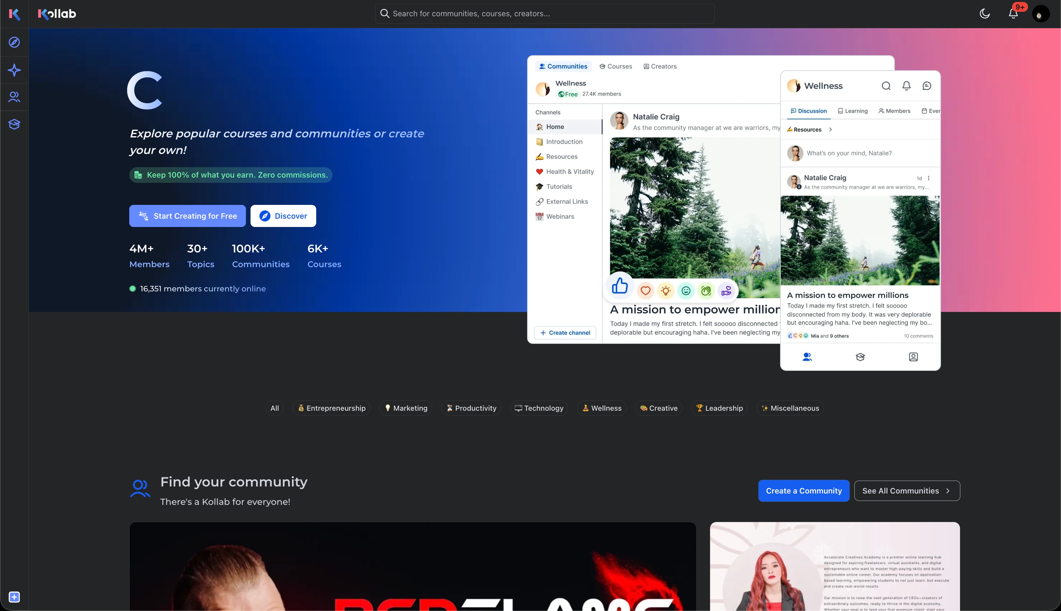
Dark Mode extends beyond individual communities to the full platform shell — including discovery, home showcases, onboarding, pricing, integrations, information pages, and account surfaces.
How It Works
As a
member
:- Open a Community on the web.
- Select the appearance switcher (?) in the top navigation.
- Choose Dark Mode.
- Your preference is remembered automatically.
As a
community
owner
:- Open your community's Settings → Appearance.
- Select the Light or Dark color mode.
- Choose a preset theme or customize the palette.
- Preview your changes in real time.
- Click Save changes.
Existing communities continue working without configuration changes. Legacy custom themes will use their existing palette when a separate dark palette has not been configured.
Why This Matters
Communities are used for long sessions - discussions, events, courses, and content creation. Dark Mode provides a more comfortable viewing experience in low-light environments while preserving each community's brand identity. Separate palettes give owners full control over how their branding appears in both modes, instead of relying on automatic color inversion.
Notes
- Dark Mode is available on the web.
- Light and dark palettes are configured independently - changes to one do not affect the other.
- Member appearance preference persists across sessions.
- A few surfaces (e.g., Studio navigation) don't yet retain the setting on navigation - this is a known follow-up.
Was this article helpful?
That’s Great!
Thank you for your feedback
Sorry! We couldn't be helpful
Thank you for your feedback
Feedback sent
We appreciate your effort and will try to fix the article